Today I’m going to show you the two most fascinating chess graphs I’ve ever seen. Of course, they’re also the only chess graphs I’ve ever seen, but still I found them utterly remarkable.
A statistician named Rob Weir did a principal component analysis of the opening repertoire of all 20 world champions (including Khalifman, Kasimdzhanov and Ponomariov, who I think shouldn’t be included, but whatever). What does this mean? Well, first it means that he tabulated the frequency of each of the 500 ECO opening codes in those grandmasters’ games, giving each player a vector in a 500-dimensional space. (We could call this the “ECO code vector” of that player.)
Five hundred is a lot of dimensions. You’d like to have a simpler way of categorizing each person’s style. Principal component analysis is the first tool of choice for data miners who want to reduce the complexity (number of dimensions) of a data set.
For example, when Netflix ran a competition a few years ago to find the best method for predicting what movies a customer would like, data miners found that the two most important predictors were: Is it a chick flick or a guy flick? and Is it serious or escapist? These categories “explained the variation” in customers’ tastes the best.
It’s very important to realize that the computer knows nothing about movies. It merely computes a number from all of its information about the movie: this movie scores 0.8 on factor 1 and -0.2 on factor 2. It has no idea what the factors mean. But when you put all the movies on a graph, it becomes instantly obvious to a human movie expert what the real-world meaning of factors 1 and 2 are. On the left you see all the chick flicks, on the right you see all the guy flicks, on the top you see the serious flicks, and on the bottom you see the escapist flicks. One of the great triumphs of principal component analysis, as a data mining tool, is that so often the most important factors do have a real-world meaning that a human expert can readily identify.
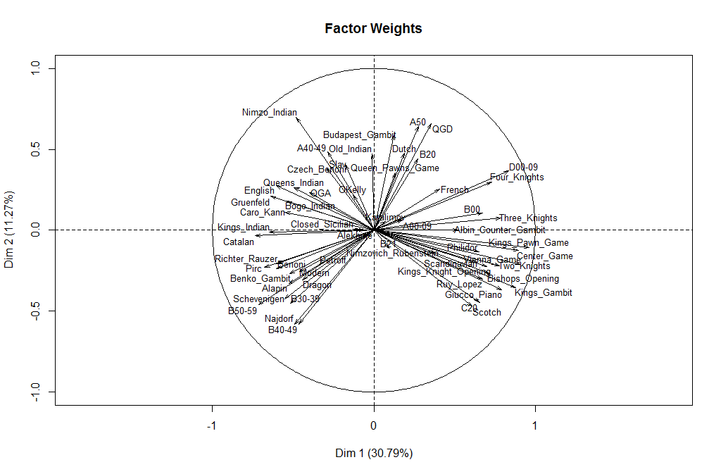
So Weir performed the same kind of analysis on the openings of all the World Champions, pulling out the two most significant factors. First, here is a graph of some common openings, showing how they score on the two factors.
The first thing we notice is that on the right we have all the “open” openings and on the left we have the “closed” ones. Thus, all by itself, without knowing anything about chess, the computer has identified that the most important characteristic of a world champion’s repertoire is whether he prefers open games or closed games. This factor explains 30.79 percent of the variation; or to put it another way, it reduces the uncertainty by 30.79 percent. If I tell you that a world champion preferred open games, it gives you that much more information about what his “ECO code vector” looks like.
The second factor, on the vertical axis, reduces the uncertainty by 11.27 percent. But the meaning of this one is much more elusive. Weir writes in his blog:
I’m having a harder time reading a real-world meaning into the second component. Maybe a reader sees something here?
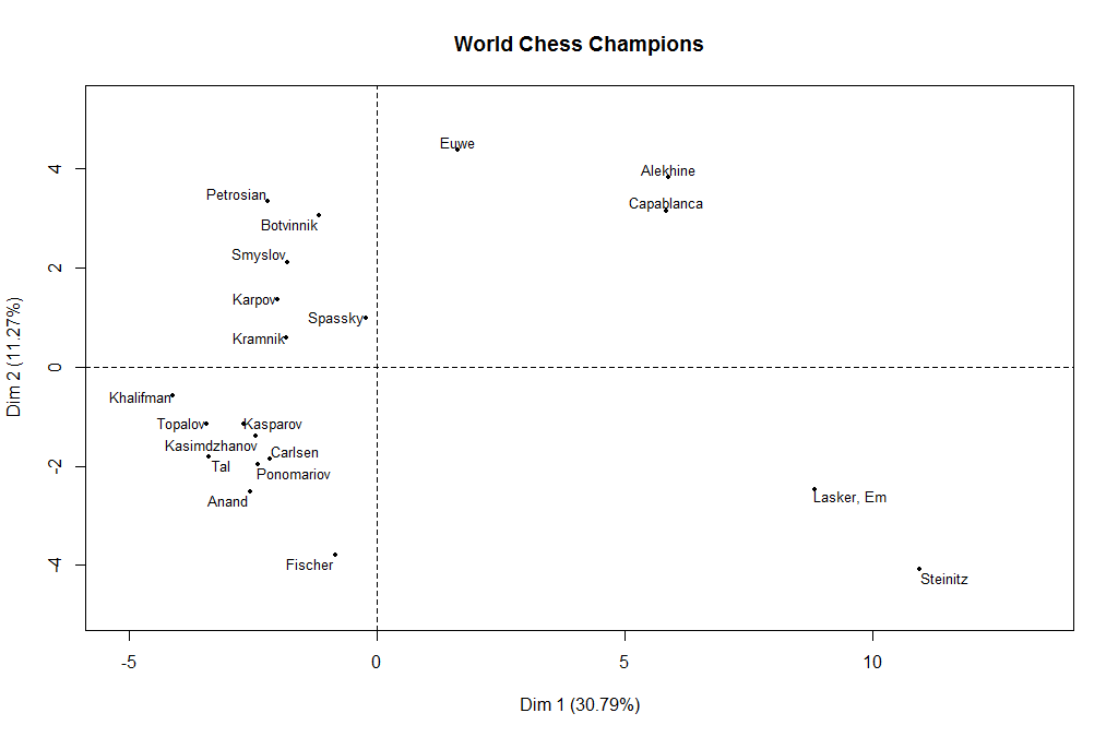
Well yes, in fact, this reader does! But the meaning only becomes apparent when we graph the world champions rather than the openings.
Do you notice something about this graph? It’s something that at first I thought was just a coincidence, but now I’m convinced that it’s real, and the computer has found a second meaningful descriptor of a world champion’s opening repertoire.
That descriptor is the era he played in. Just look at the champions in chronological order! We start with Steinitz and Lasker in the lower right. And then we gradually move counterclockwise: Capablanca and Alekhine come next, and then Euwe. By the time we get to the next world champion, Botvinnik, we are for the first time in the negative territory on the “open-closed” scale. And we keep moving counterclockwise, all the way through Anand and Carlsen, the two most recent champions.
However, there is one world champion who is an exception to this story: Bobby Fischer. If Anand and Carlsen have a 2010’s-era repertoire, it seems as if Fischer took his repertoire from the 2050’s. He is the only champion who departed completely from the opening repertoire of his era.
Once again, I remind you: the computer knew nothing about chess when it identified factor 1 (open/closed) and it knew nothing about chess history when it identified factor 2 (time). From the data alone, it has pulled out what it considers the two most significant pieces of information, which together account for 42 percent of the variance in a world champion’s repertoire. If you tell me his open/closed preference and the era in which he played, you have given me 42 percent of the available information about his ECO code vector. Unless his name is Bobby Fischer.
Why was Bobby Fischer so different (or as statisticians say, an outlier)? I think that this gets to the real message of the second graph. It’s telling us that opening styles evolve. Alekhine and Capablanca evolved from Steinitz and Lasker. The Soviet champions from Botvinnik through Kasparov also evolved, each one changing a little bit from his predecessor. This evolution always goes more or less counterclockwise. Why does it always go in the same direction? I have a hypothesis about that, too. A new generation of players always wants to differentiate itself from its chess “parents.” But it does not want to do that by doing what its chess “grandparents” did. So that means it will always move in the opposite direction from the grandparents. This perpetuates the counterclockwise opening cycle.
Fischer was the only world champion who did not evolve from his predecessors. He was sui generis, Latin for “one of a kind.” In his radical preference for 1. e4 as White, he was like a nineteenth-century player. In his preference for the Sicilian as Black, he was like a twenty-first century player. As a result, his point on the graph is kind of halfway between the two.
I was quite surprised to see that Anand and Carlsen are more Fischer-like than their predecessors, but the graph suggests that this trend will continue to the next champion after Carlsen. Maybe by the year 2050, we’ll once again have a truly Fischer-like world champion!


{ 6 comments… read them below or add one }
Tal seems quite out of his era as well and Kramnik looks like somewhat of a throwback.
Hi Robin! Couldn’t agree more.
Dana, if those are the only chess graphs you’ve ever seen, you’re definitely not familiar with the chess-related data mining by Randal Olson. For example:
“A data-driven exploration of the evolution of chess: Popularity of openings over time”
http://www.randalolson.com/2014/05/26/a-data-driven-exploration-of-the-evolution-of-chess-popularity-of-openings/
“The key to Magnus Carlsen’s success as a chess grandmaster”
http://www.randalolson.com/2014/06/07/the-key-to-magnus-carlsens-success-as-a-chess-grandmaster/
Interesting insight: “What has been the key to Carlsen’s success? Below, I charted Carlsen’s win, loss, and draw rates since 2001. Surprisingly, Carlsen doesn’t seem to be winning more games today than he did in 2001. Instead, it appears the key to his success is taking games that he used to consistently lose — especially games as Black — and instead forcing them into a draw.”
“Chess tournament games and Elo ratings”
http://www.randalolson.com/2014/05/24/chess-tournament-matches-and-elo-ratings/
The unsurprising, but still interesting, takeaways from this one include:
*ELO ratings tend to predict game outcome
*Uneven chess games tend to end faster
*The percentage of non-drawn games won by White increases as the average ELO rating of the two players increases
*Draws are more common in expert games
“A data-driven exploration of the evolution of chess: Game lengths and outcomes”
http://www.randalolson.com/2014/05/24/a-data-driven-exploration-of-the-evolution-of-chess-match-lengths-and-outcomes/
“A data-driven exploration of the evolution of chess: Moves, captures, and checkmates”
http://www.randalolson.com/2014/05/27/a-data-driven-exploration-of-the-evolution-of-chess-moves-captures-and-checkmates/
Great stuff! Thanks, Jim! One of the purposes of data mining is to gain insights that might have been missed by even an expert in the domain. To me, Weir’s second figure really stands out in this regard. Some of Olson’s figures also provide good insights. The change in usage of rooks, knights, and pawns over time is really a surprise, for example.
The increase in the length of games over time is less of a surprise, but quite important. One of the great abilities of modern players, especially Carlsen, is the ability to “keep a game alive,” so that instead of petering out to a draw the position maintains some winning chances for 50, 60, 70 moves. I think that is driving the increase in game length.
Hi Dana, I added an additional graph to that blog post to try to tease out the year effect. There certainly is a strong alignment of year with the first component.
See: http://www.robweir.com/blog/2015/02/analysis-of-world-chess-champion-opening-repertoires.html
The next thing I want to try is to look at strong games from a more limited time period, say 2000-2015, so the 150 year long evolution of opening theory is not such a large factor. In other words, it might be more meaningful to compare Anand and Carlsen if we don’t also need to explain Steinitz at the same time.
Hi Rob, thanks for your reply and thanks for posting my comment on your post! I have two comments.
(1) I think it would be a very good idea to do the 2000-2015 time period. With the year effect removed, you might be able to identify other meaningful principal components.
(2) Although I know the mathematical theory of PCA is based on the idea of *linear* components, I think that this is a case where the data itself is telling you something different. When you flatten down the chronological process into a line, you miss the ways in which Capablanca, Alekhine, and Botvinnik were moving in a direction that didn’t strictly fit the open-closed dichotomy. You *completely* miss the difference between Botvinnik and Fischer, who are similar on the first component but at opposite ends on the second component.
For the time being, I’m sticking to my hypothesis that the two most informative domain-specific pieces of information in this data set are not x and y, but x and theta. I’d be willing to bet that such a phenomenon has not been reported before in the literature on principal component analysis!